The Evolution Of App Store Screenshots
Like many other designers, entrepreneurs, and consumers, I spend countless hours perusing the Apple App Store. I’m always curious as to which applications are performing well and what creative new ideas are being released. One of the more recent changes I’ve seen among popular applications is the shift toward more descriptive screenshots.
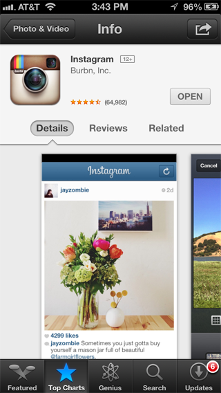
If you had browsed through the app store months ago, you would have been far more likely to see nothing more than screenshots of each application without a description included in the images. Even Instagram continues to use this strategy to this day. If you browse to Instagram in the app store, the first thing you’d see is as follows:

If for some reason you live under a rock and aren’t a user of Instagram and have no friends who use Instagram, the first screen would only provide clues about what the app does. It appears to be an application that has to do with photography. This is derived from the app icon and the display of an image in the first screenshot. Aside from that, it’s not clear what the app does.
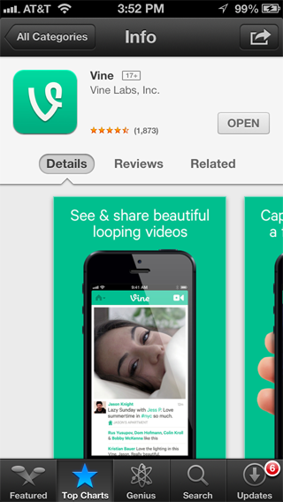
Let’s compare Instagram’s screenshot with Vine’s:

When you load the app listing it’s immediately clear what Vine does: enables users to “see & share beautiful looping videos”. It’s a significant distinction and it’s important now that application descriptions fall below app screenshots in the app store. If you browse through other apps, you’ll notice that many others are now adopting this approach.
I’ve seen a number of creative approaches to app store screenshots and can only imagine more will come. For those looking to make the best impression and increase their downloads it would make sense that these images include the following details:
- What the app does
- What makes it unique
- Other reasons the user should download it
- Illustrating how easy to use the product is Let me know if you’ve seen any unique app store screenshots!