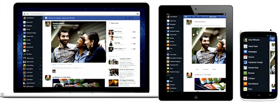
The Web Is Now Mobile
One of the most significant takeaways from Facebook event today was a user interface adjustment: on desktop, there is now a navigation bar on the left hand side that slides out in a way consistent with their mobile interface. As soon as I saw that Medium had implemented a similar design on their site, I knew it was going to become the new standard.
Let’s be honest, we now switch between our mobile devices and desktop devices in an instant and we want to be able to have a consistent experience. We want the experience to be easy-to-use no matter where we are. Consistency, is the key word. Designers and developers now must conceive of ways to ensure that all the actions in their products can be completed both on mobile and on desktop.
The result: responsive HTML5 design. Whether or not you like it, responsive design is the new standard. That’s because it also happens to be the easiest to implemented for small startups. Does a team of 1, 2, or 3, have the time to build Android, iPhone, and web applications? Unless that team is a group of world-class engineers, the most likely answer is no.
That’s why there will now be one application that works both on mobile and on web. We saw that in today’s Facebook announcement.
